Money Dashboard
The original money management app
TLDR
Making money management easier
Disclaimer
This work was performed whilst as the Head of Design at xDesign
Our role
Our role within this project was to collaborate with stakeholders from Money Dashboard, xDesign, to wireframe and create UI for iOS and Android versions of a new mobile application.

Understanding the problem
Money Dashboard are an Edinburgh based Fintech startup. They had a strong web based product but this didn't translate well into mobile.
After a successful round of funding to enhance further growth, Money Dashboard enlisted the help of xDesign to design native mobile apps that would enable the expansion their user base and make the most of the technology available at the time.
Due to the budget, we only had a few weeks to turn this around.
Design
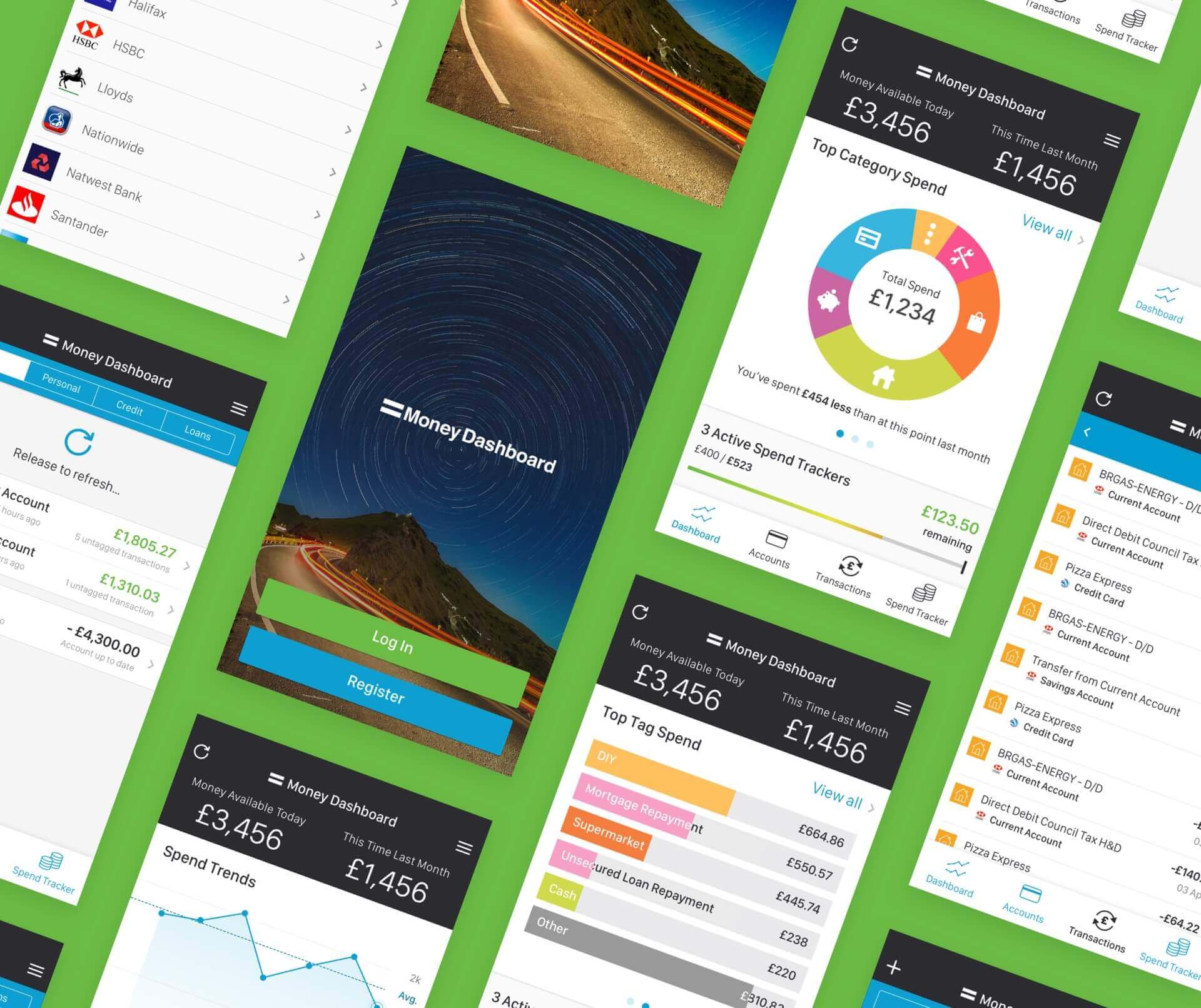
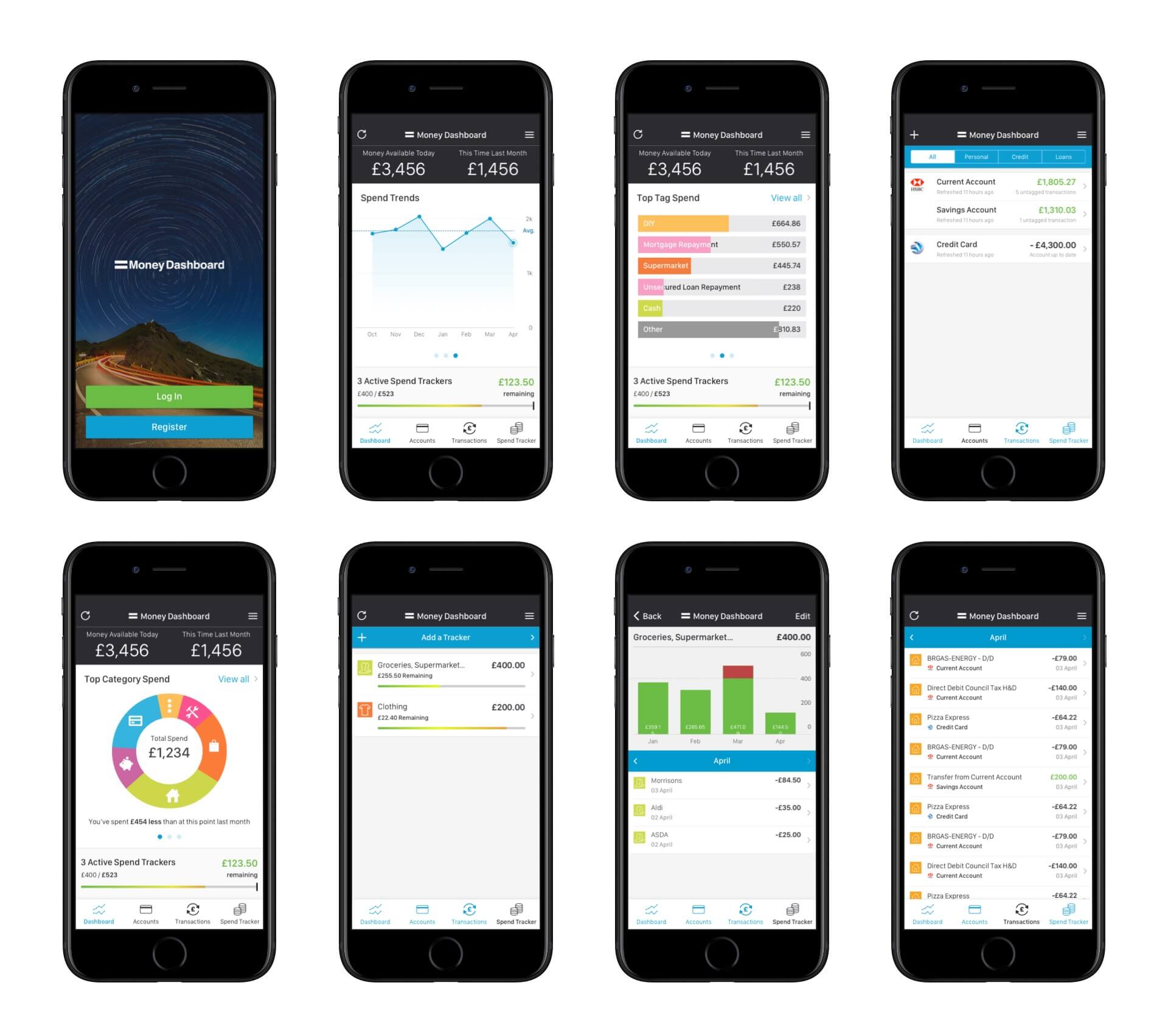
We knew from Money Dashboard what features were most popular and what would need more focus from a mobile perspective.
We wanted the features to be recognisable from the website, yet feel native to a mobile device, and we didn't want to cut features just to deliver on time. We wanted to build on them.
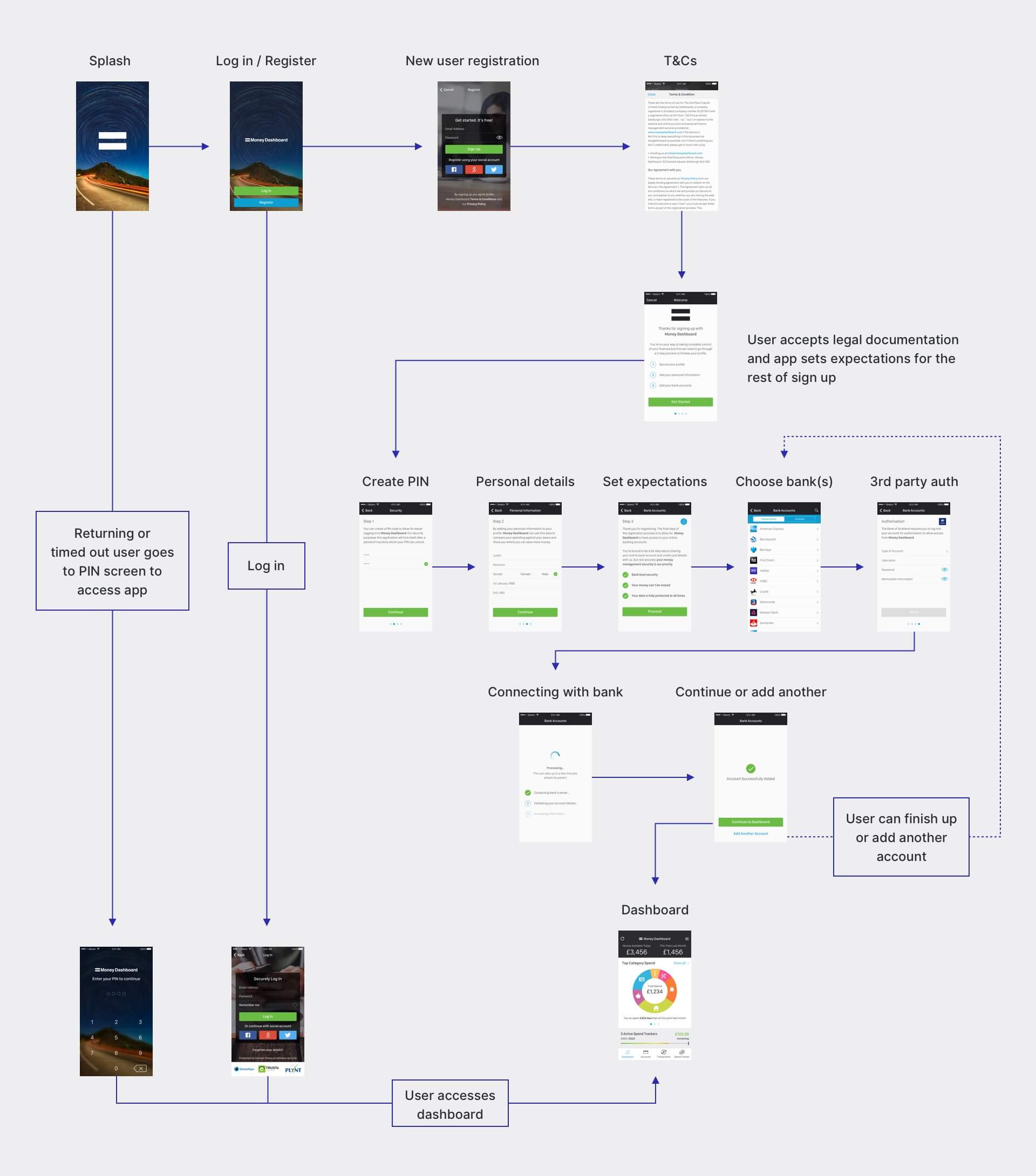
Onboarding
Whilst we focused on creating a transferable environment for current users, we also wanted the new Money Dashboard app to feel fresh and modern for new users.

Implementation

Results
Since the mobile application launched, Money Dashboard have continued to grow and have secured close to £5m in crowdfunding in the years following the roll out of the new app.
We kept an eye on App Store reviews to see what people thought of the new app and we were blown away by the response. Some of the responses include…
Lessons learned
Money Dashboard had secured funding to expand their platform but the majority of this went into development costs and as a result, the time to turn around the designs was tight.
We didn't want to reinvent the wheel but still provide Money Dashboard value for money and give them a platform to carry on their growth. At the time the app was published there was no other comparable money saving application on the market, the Fintech phenomenon hadn't quite started and banking apps were all still focused on, well, banking.
Features like tagged spending and savings goals are quite standard across the industry now but when we helped launch the Money Dashboard app these features were ahead of the curve.
We can help you to do more with digital
Your targets are our targets. We approach every project with empathy, creative thinking and a focus on user experience.
Conclusion
We saw the value in what Money Dashboard wanted to do and we believe the design processes, creative output and work that we performed, in some small part, helped them get to where they are today.
This project was a great example of being able to work within tight budget and time constraints, knowing when and how to create value and enabling startups to continue with their growth.
Get in touch to find out more about our design process.